Each year, leading design agencies, color institutes, and paint manufacturers announce the shades that will dominate fashion, design, and interior decor. These colors aren’t just aesthetic choices — they reflect the spirit of the times, societal moods, and the collective desire for harmony, stability, or change.
In 2025, interior color palettes are shifting toward softer, enveloping, and nature-inspired hues. The trending tones aim to create coziness, emotional balance, and highlight individuality in interior spaces.
This article explores the top colors of the year, how they influence perception, and — most importantly — how to use them stylishly and sensibly in your home.
Why Color in Interiors Matters More Than You Think
Color is more than just paint on the walls or a throw pillow selection. It directly affects psychological well-being, productivity, and the overall mood of a home. Color can soothe or irritate, visually enlarge a space or make it feel cozier, highlight architecture or hide flaws.
That’s why choosing a color palette is not just decorative — it’s a tool to create a sense of comfort, protection, and harmony in your living space.
Top Colors of 2025 and Their Characteristics
Here are the standout shades for interior design in 2025:
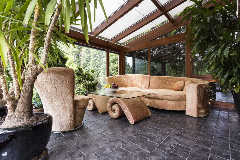
- Honey Amber – warm, soft, and enveloping; ideal for creating a cozy atmosphere in living rooms or bedrooms.
- Misty Blue – cool and relaxing, pairs well with neutrals and wood.
- Olive Green – earthy and grounding, perfect for kitchens, studies, and balconies.
- Sandy Beige – a new neutral that’s warmer than gray but doesn’t overwhelm.
- Terracotta with Rose Undertones – bold yet modern, works well in textiles and accent decor.
- Sage Gray-Green – versatile and refined, sets a calming tone in any room.
These colors share a softness and complexity. They’re non-aggressive, blend easily with other elements, and adapt to various styles from minimalism to boho.
How to Use Trendy Colors in Interiors Effectively
Remember: just because a color is trending doesn’t mean you need to repaint every wall. The key is thoughtful, measured integration.
Tips for using trending hues:
- Start small: try pillows, vases, textiles, or art pieces.
- Use paint on one accent wall instead of a full room.
- Combine with neutrals: white, gray, or wood tones.
- Repeat the color in several areas for a cohesive look.
- Test paint on large swatches — lighting affects how it appears.
Trend colors should enhance the mood, not dominate the room.
Table: 2025 Color Trends and Best Areas for Use
| Color | Characteristics and Emotional Effect | Best Interior Applications |
|---|---|---|
| Honey Amber | Warm, cozy, enveloping | Living room, bedroom, textiles |
| Misty Blue | Calm, cool, refreshing | Bathroom, kitchen, bedroom |
| Olive Green | Natural, grounding, stable | Kitchen, study, entryway |
| Sandy Beige | Neutral, light, warm | Walls, furniture, rugs |
| Terracotta with Rose | Modern, expressive, warm | Accent walls, pillows, decor |
| Sage Gray-Green | Balanced, elegant, harmonious | Bedroom, study, bathroom |
Best Interior Styles for the 2025 Palette
The trending colors of 2025 work beautifully in many popular design styles, particularly:
- Modern Minimalism. Sandy beige and sage offer a clean but cozy aesthetic.
- Eco-Style. Olive and terracotta highlight natural materials and simple forms.
- Scandinavian Style. Misty blue and honey amber add warmth and softness.
- Soft Industrial. Sage and sandy tones balance colder loft elements.
- Boho. Trend colors mix well with patterns, textiles, and vintage decor.
Common Mistakes When Using Trend Colors
Avoid these pitfalls to keep your space stylish and balanced:
- Overusing one shade — even the best color can overwhelm in excess.
- Ignoring lighting — warm lights can distort color perception.
- Mixing clashing tones — not all trends suit your existing interior.
- Blindly following trends without considering your lifestyle and taste.
- Using low-quality materials — bright tones highlight imperfections.
Trends are guidelines, not rules. Let your space reflect your personality, not just what’s popular.
FAQ: Frequently Asked Questions
1. Can I use multiple trending colors at once?
Yes, but make sure they match in tone and saturation. Choose 2–3 and repeat them throughout the space for balance.
2. What if a trending color doesn’t suit my interior?
No need to go all-in. Use it in accessories — a throw blanket, artwork, or a vase — or just take inspiration without direct use.
3. How can I tell if a color will work in my home?
Try a sample on the wall or gather fabric and decor swatches. View them in both natural and artificial light.
4. Which colors go out of style quickly?
Neon, overly cool grays, and acid brights. These tend to age fast and visually tire the eye.
5. Are there timeless colors that are always in fashion?
Yes — soft neutrals like beige, warm gray, white, and natural greens. They’re highly adaptable and complement most trends.
When chosen thoughtfully, color is like great music — it sets the mood, defines the character, and turns a house into a home you love coming back to every day.
Leave a Reply